I’m trying to compare working spaces and their effect on final printed output. Specifically, I want to compare ProPhoto To Adobe RGB and compare ∆E of the final printed output on a high gamut glossy inkjet paper.
I expect big shifts in those colors that are outside of the Adobe RGB gamut but within my printer gamut.
However, I’m more interested in seeing how much ∆E occurs in those colors that are in gamut for both Adobe RGB and the printer profile. Basically, I am looking to see if the larger working space is a bad idea as a general working space and how much it will effect the “average” image. Adobe RGB clips a lot of blues, greens and other colors that my printer can print.
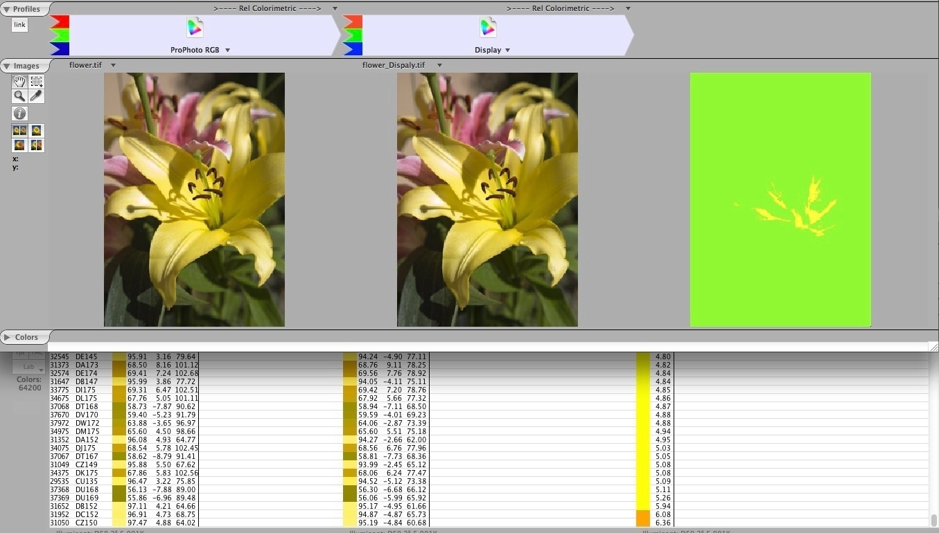
How do I set that up in ColorThink Pro? I tried starting with a downsized 729 color TIFF ProPhoto target and extracting unique colors. But, the Adobe RGB version (converted from ProPhoto to Adobe RGB in Photoshop) I imported has fewer unique colors than the ProPhoto version so my lists are different. I also tried using the color worksheet , chaining ProPhoto -> Adobe RGB -> Printer profile, but the color worksheet sees the 2nd conversion as a new workflow, instead of the third part of a chain.
Lou, this video might help, lots and lots of examples using ColorThink:
Everything you thought you wanted to know about color gamut
A pretty exhaustive 37 minute video examining the color gamut of RGB working spaces, images and output color spaces. All plotted in 2D and 3D to illustrate color gamut.
It’s made for printing but can be used in CT. Resize way, way down (like 300x300 pixels).
Convert a copy to Adobe RGB (1998) of any other working space you wish. Or to an output color space.
Then you can bring that into CT and plot the gamut in 3D. Or build a Color List (extract unique colors) and compare them or build a dE report.
Thanks, Andrew. I watched the video and enjoyed it, learned a few things about setting up worksheets in ColorThink, and appreciate the other links you provided.
In your experience or data analyses, do you find that you get bigger color shifts when converting to a large gamut printer space from a much larger working space like ProPhoto, compared to Adobe RGB? I’m talking about the colors that natively lie inside the printer gamut. I know ProPhoto will preserve all those saturated blues, greens, cyans, etc. In other words, do you see much ∆E difference on ProPhoto -> printer conversions vs Adobe RGB -> printer conversions for the colors that are in gamut for all three spaces? I hope I expressed that clearly.
I guess I have always been a bit gun-shy with ProPhoto because it is SO large. My monitor encompasses the Adobe RGB gamut, so anything outside that gamut I can’t see. I’m always concerned about generating garish, neon prints and getting some wild surprises. Or, having important in gamut colors shifting due to huge conversions from ProPhoto -> printer space.
I have been trying to decide on a standard working space for my digital camera work. I’ve been evaluating Adobe RGB (which is what I usually use), ProPhoto, Beta RGB and a few others. Up to now, I have used Beta RGB or ProPhoto RGB only when I have highly saturated images. The rest of the time I use Adobe RGB, or sometimes sRGB (for web or very low gamut images).
Let’s examine ProPhoto to sRGB since your timing for the question is excellent. I’m just finishing up another video on just that subject. Here’s a rough cut (it still has to go under some peer review hopefully from Steve Upton and the gang on the Luminous Landscape forum):
What I say in the video that I know is spot on is that IF you work with an Adobe raw converter as I do, you’re working in a ProPhoto RGB gamut, so it seems foolish to use anything smaller to encode into a master image from raw.
Andrew, I watched your new moving on Wide Gamut Print. Very good.
I’m sold on the use of ProPhoto for capturing the maximum gamut and not clipping any printable colors. I’ve done that test before and there is no doubt in my mind.
I’m a little less clear how the less saturated, in-gamut colors will change during conversions. Maybe the difference between ProPhoto and a smaller working space is inconsequential. Converting from ProPhoto RGB to Epson Premium Luster on a 3880 involves much bigger moves than converting from Adobe RGB or sRGB. I’m ignoring those ultra saturated colors that lay outside sRGB and Adobe RGB for the moment and just trying to understand better how skin tones and lower saturation colors will be affected.
I have no set agenda here. I am just trying to see both sides of the ledger, pluses and minuses, so I can evaluate carefully. Your video touched on the potential for surprises in print output because our monitors can’t see all the colors our printers can print.
Any thoughts on those “in gamut” colors and differences between conversions with ProPhoto vs Adobe RGB or sRGB?
If I knew from the get-go that the raw image I hoped to process could fit within sRGB with out any clipping, I’d pick sRGB. Otherwise the larger color space is far less efficient. But it’s not easy to do this on an image by image basis. And further, any editing you provide in at least the Adobe raw processing path takes place in ProPhoto RGB gamut (primaries) but with a 1.0 TRC Gamma so that might be moot anyway.
Ultimately there is no perfect RGB working space or we’d just use that one.
AndrewFair enough. I agree with using the smallest gamut encoding necessary for a file.
I guess one could soft proof an image in LightRoom with sRGB or Adobe RGB and turn on the destination gamut warning. This won’t cover you if you decide afterward to pump up the image, but it would provide an indication.
Agreedno perfect working space exists. Thanks for the help and the great videos.
I try to use the histogram in Lightroom to judge if there is any colour clipping when I soft proof against Adobe RGB. Wouldn’t I be able to spot those images that have saturated colours outside the Adobe RGB space then?
I’ve used this method since Lightroom gave me the chance to do soft proofing. And I’m often surprised to see that images that for me seems to have muted colours still have a lot of colours outside of Adobe RGB gamut.
The major reason for me to recommend Adobe RGB, when it’s possible to use that space without clipping, is that I find that many photographers don’t understand that it is so easy to push colours way outside of what is printable when they work in Prophoto. And even small tweaks to settings give a huge change in colours when they work in Prophoto.
I agree that for images that contain saturated colours, Prophoto is the way to go.
