i built an RGB profile with profile maker for a matte paper.
and i built a profile for the same paper with a RIP.
now i would like to see if i gain some gamut with the RIP…
i tried to compare the profiles but i dont think this really makes sense as one is an RGB profile and the other is 7color… and has a lin and different settings?
i have a HUE test picture that includes patches with RGB 255/0/0… 0/255/0 and so on. in proPHOTO…
should this picture bring the extreme possible colors if i print it with those profiles and perceptual rendering? or absolut?
If you have to do your profile comparison by viewing your printed work, then yes, an extremely saturated image like you describe would show you the differences in the primary colors. You would want to use Rel Col in order to get the most saturated colors.
A RIP will generally give you a better gamut in the shadow areas, which might not be covered in the image you’ve got.
If you don’t have ColorThink, you can send me your profiles and I will drop them into ColorThink and post the results here. It will work with RGB & CMYK equally well. This will show you an actual gamut volume number as well as a visual 3D graph to see where the gamuts intersect / overlap.
Here you go:
The gamut of the RGB is indeed larger than the CMYK+RGB profile. A rough estimate of the cubic Lab values would be 494,000 for the RGB vs. 482,000 for the other.

In this 3D view, the green wireframe volume is your Moab RGB profile. It is larger in the yellows and greens, but the other profile is larger in some dark blues.

I did notice a slight wrinkle in the red portion of the 7 color gamut. It might be that there was a problem in the measurement of your target in this area that caused a problem with the profile itself. So you could try measuring the target again, and rebuild the profile.
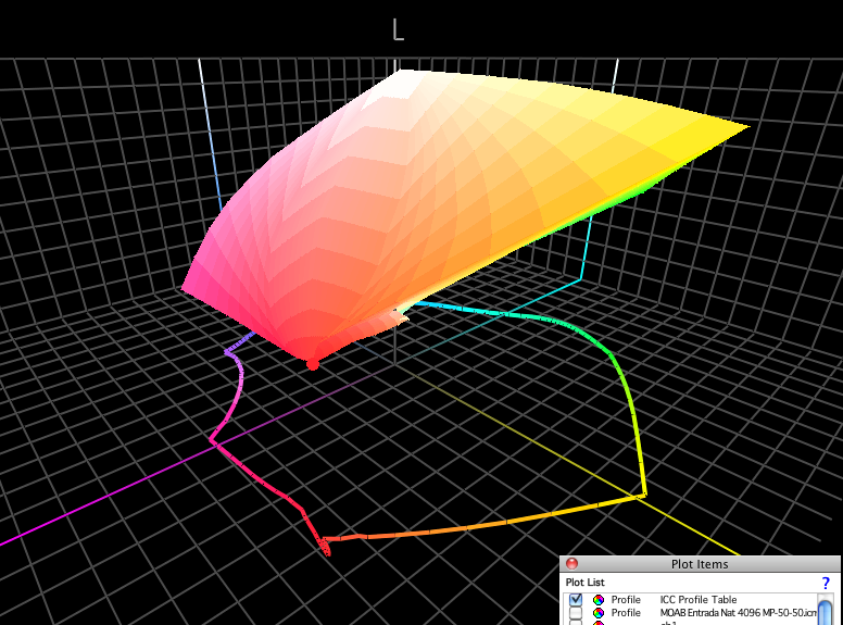
I see other things - the neutral rendering of your 7 color profile is very erratic as it gets down to darker colors. By contrast, the RGB profile looks normal in all respects.
You can also click this link to download a 3D movie showing all the way around these two gamuts in ColorThink. This can be viewed on a Quicktime movie viewer.
dl.dropbox.com/u/10782857/RGBvsCMYK%20movie.mov
thanx patrick! thats so coool.
when i printed the extreme hue patches the 7c profile had more saturated colors to show… specially in the blue as you say, too.
what do you think why the light green gamut is smaller? did i limit yellow too much?
so i can actually compare those 2 profiles ? i thought you cant do this, as 7 color profiles are not displayable?.. why so ever…
about the neutral gray axis… hmm… when i print a gray wedge it looks totally neutral to me and absolutely linear … compared to the RGB where the shadow is blocked but neutral.
when building the 7c i had max black
